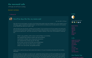
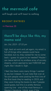
Responsive design issues
Jan. 4th, 2019 11:11 am![[personal profile]](https://www.dreamwidth.org/img/silk/identity/user.png) tickletheory
tickletheoryI'm trying to work out an issue with Dreamwidth stripping the viewport meta tag when a theme is NOT using the layout's default stylesheet. I do this to avoid repeating CSS, keeping it a bit more lightweight, even if it means 9k bytes less to load.
I've posted this question on![[community profile]](https://www.dreamwidth.org/img/silk/identity/community.png) style_system. If there's no resolution for this, uh, I'll have to re-evaluate my approach. Duplicated css but responsive > lighter, no duplication css but not mobile responsive? Argh. So frustrating.
style_system. If there's no resolution for this, uh, I'll have to re-evaluate my approach. Duplicated css but responsive > lighter, no duplication css but not mobile responsive? Argh. So frustrating.
Whatever the outcome, I'll have to eventually go back to the themes I've posted here because they are already responsive. The absence of the meta tag just keeps it from triggering. :
I've posted this question on
style_system. If there's no resolution for this, uh, I'll have to re-evaluate my approach. Duplicated css but responsive > lighter, no duplication css but not mobile responsive? Argh. So frustrating. Whatever the outcome, I'll have to eventually go back to the themes I've posted here because they are already responsive. The absence of the meta tag just keeps it from triggering. :